2015年9月28日星期一

Poster


Concept 
My major is Animation and I also want to animation as my lifelong career. Miyazaki Hayao is my favorite Animated film director. From his movies, I felt that his works are sincere and courageous, there are many pure things are represented in his movies, it is like a fruit hard candy.

In addition, the action animation is also my favorite, the excited fight scenes, the dynamic camera angles and the inspiring music background, all the elements combine together to make my blood boil. The action animation feels like the super spicy chili.

I want to combine these two styles of my favorite and transform into my own style of my animation. Therefore, the hard candy and spicy chili came out from my mind. Then the idea has come, which is a hard candy with the chili flavor.

However, for my poster, I encountered a problem which how to express the candy is very spicy. I tried to use a candy with the red color on my poster, but it is not successful. Then I added fire behind the candy, but the image looks like a poor advertising. 
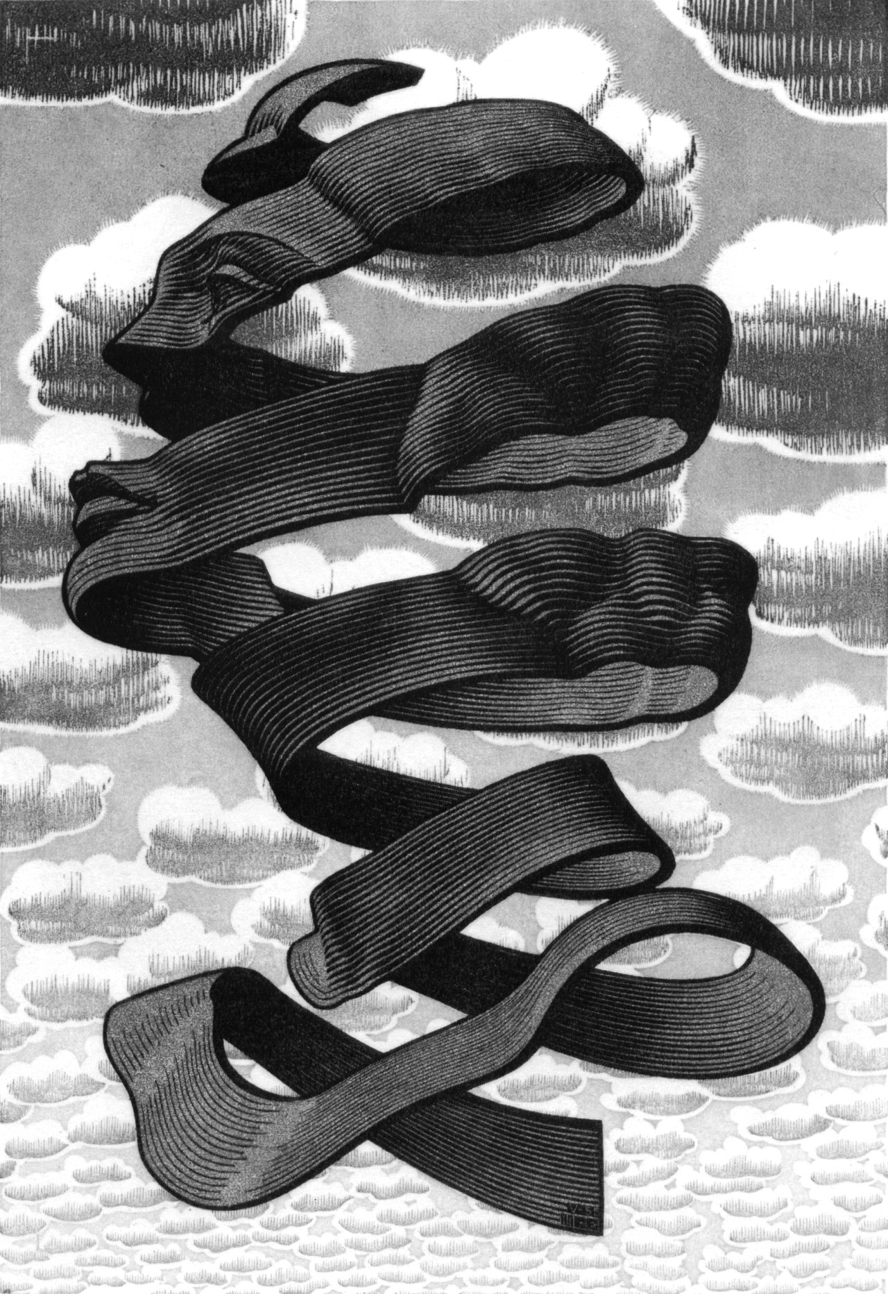
Finally, the muse came to see me, I designed a candy with a chili form and it has the colored banding. The banding is used black color in order to differentiate the Christmas candy and I applied reification of the Gestalt principle for the chili candys body. In addition, I added the sun as the background. The Sun symbols the courage and the chili candy, pure red color all represent my passion. From the bottom of my poster, a pan at the beginning, then there are a bulb, a mouth, Miyazakis dodoro, a man who is holding a sword, a big hand. All these element express that my paining skills, my ideas, my purpose which bring laugh to the audiences, my inspiration all the factor like a big hand to support me to create my style of chili candy. Im a simple person and I want my animation can give the audiences a lot of courage. Therefore, my posters structure keeps simple and I uses a black background to stand out the chili candy and sun.


Task

These three posters are all from Luba Lukava,world-renowned artist and professor. This collection swiftly and ably showcases Lukova's masterful use of metaphors and symbols to express themes that include peace, war, ecology, immigration, media, corruption, censorship, and Sudanese poverty. The first example, event it is called peace, the metaphorical expression is to satirize. She uses closure of Gestalt principle to create a peace dove on the center of this image. However when we see this image clearly, this peace dove is build by a lot of shapes which are missiles, tanks, soldiers etc. For the color, she applied blue and white which are all symbol peace and pure. 

When I see this poster firstly, I though this is quite interesting. It is called brainwashing, there is a washboard called 'Media' where is washing human's brain. But the man's face still is smile. All the elements combine together to express deeper meaning for media business these days.It gives afford for thought. She still uses simple composition which put the man in the middle with white background. There is no shadow and it is used pure color.  

Fun is the sun,very interesting, Luba uses quite pure blue color as the sea's color and also uses the same color to be the background. In addition, the light blue as the support color is used on the skin's color of the man. For this work's visual structure, it just like a normal life photo in order to represent deeper meaning.    

2015年9月20日星期日

Week 9 Task 1

I uses several 'me designer' to arrange an axis in order to separate two parts, the main part is on the right where has some fonts.

 Radial, In general, all elements extend from a point of focus. However, I changed the point to a square, then I still followed the way which is a radiative trend.

For the principle of Dilatation, all elements expand from
a central point in a circular, but I applied the reification principle of Gestalt to make the structure looks like a raised disk.  
I applied the circle as the focus, then make a hole on this black circle. My purpose is that expressing the banding have two positions which are front and back. In addition, I also put the font the banding.

 I put several lines on this image firstly to make the Sudoku, then I selected different elements on each  grid.

I applied four shapes and arranged these as a line from large to small. In addition, I used some fonts as layered banding at the bottom of this work and applied a few of fonts around the first shape.

I used 8 black squares to arranged this image irregularly, then I applied the closure principle of Gestalt to represent 'Me design'.  

I made a line as the axis at right on this image firstly, then I played with these font and arranged them. Next I deleted the line, created some shapes on the there in order to express the axis. 

2015年8月30日星期日

Postcards with color


Post card (black and white)

For my postcards, I decided to go with four planets, because the letters 'ER', 'JP', 'VN', 'UN'are for Earth, Jupiter, Venus and Uranus. I have applied the gestalt principles of closure and reification.

2015年8月25日星期二

Color theory examples

Primary Colors
This photography is applied primary colors as the background, the purpose is to out-stand and unify the style of the coat  and color. In addrion, it expressed that the coat's color is very pure. The whole picture is quite bright.

Secondary Colors
This photograph uses the Orange and green color. The dress is very outstanding, Because all the objects are used green color expect the dress, therefore the audiences  let the objects as the background. the picture is just  used secondary colors, so the color still seem very bright. 

Tertiary colors
Each color on this woman's dress is tertiary color, audiences still can feel the contrast color style, even each color has been mixed by three colors.

Analogue colors
As we can see, the focus of this photograph is on the left part, the two walls' color and the woman's dress are the analogical. For another, the color of the sky, trees,  grassland, ground are similar. Therefore this image can be as two parts.

Complimentary colors
In the photo, it just has two color, Orange  color contrasts sharply with blue color.


2015年8月11日星期二

M.C. Escher illustrations

M.C.Escher
His artworks have been applied many Gestalt principles,thus Escher's works give audiences a visual effect.  

For this artwork,Escher has applied the reification of Gestalt. As we can see, the black bandage goes around from the bottom to the top, through the trend of bandage makes audience's brain create a dimensional image. In addition, the closure principle also has been used in this image, even though some parts of the portrait are missing, it still is visible. Because audience's brain through the imagination and combine the normalcy in the general life, then audience can draw the conclusion. 


This picture has been used the similarity,proximity, closure, figure and ground. In this image, each animal is similar to other one, that is similarity. Then seeing this work from a distance, it is a group, thus the proximity has been applied. After that, each animal's shapes are create by the other animals', therefore it is closure. Finally, when the audience only see an animal, audience's eyes would make other animal's as the background automatically, the figure and ground principle has been represented.  


This drawing has been applied the reification theory, it makes the drawing seems like someone put a crystal ball in front of the buildings. However, Escher does not draw any ball on there, it just different trend lines.

2015年7月24日星期五

Task 1 Research

The three fonts that I like most: 


1.

COCOMAT is a typeface variant from the COCO GOTHIC family of sans serif geometric typefaces. It’s inspired by the style of the twenties and the visions of Italian futurists. According the futurists, this font has some elements of modern sense, such as that this is sans serif, so this font looks more simple. For the design, the bowl of COCOMAT font is quite plump and the position of crossbar is very low. In addition, all the strokes are quite thin. COCOMAT has a very simple style, it can be used in many places, such as poster, magazine etc.


2.

I like this kind of style, it gives me a feeling of elegant and fashion. I love sans serif, if we say that the serif represent romantic, traditional, the sans serif might express simple simple, clear. In addition, I really like the letter is thinner than the regular size. For this font's design, the characteristic, such as letter 'y',  its curvature of descender is same with the upper part and the strokes of 'w' and 'k' are interlaced.


3.

Keep Calm is a family of fonts developed from the now famous World War 2 poster that was designed in 1939 but never issued, then rediscovered in 2000. For this font, the tip of each stroke is flat and the proportion of structure is quite standard and makes me feel very comfortable and clear.
________________________________________________________________________________


The three fonts that I don't like:

1.

My teacher said a thing in our class, it is that don't make the typeface too long, that will spent too much space for next line. Even this font is used sans serif, the tip of each stroke still imitates handwriting style, such as letter 'y', 'd' , 'b' etc, these letters have wide curve descender and stem. Therefore, As my personal opinion, I don't like this kind of style.


2.

If I look these letters from a distance, I can not see very clearly. This font has decorative background, but the strokes were too thin, even though I like some designs which the strokes are thinner than the regular. However, under this kind of comparison, no matter these letters are changed how many colors, the attention of the audiences still is the background, not the letters themselves. 


3.

Considering the visual sense of the audiences, I think the stroke of this font is too thin, I can not see clearly from afar. Also it can not be able to be used in small size. According above few letters, these seem like serif, the letter's descender , such as 'y', it does not get much extension. I don't like this kind of style, because I get a feeling which this is more like sans serif style,even thought it is not, I am a little bit confused.